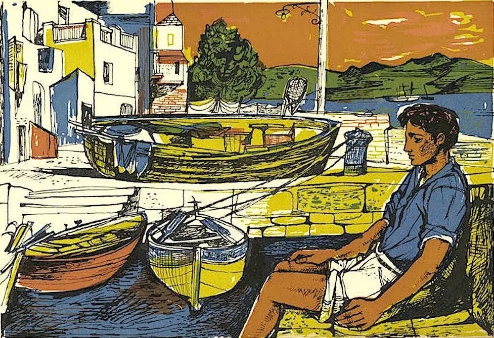
When in October 2016 Folio Society commissioned me to produce new covers and illustrations for Patrick Leigh Fermor’s books on Greece – Mani (1958) and Roumeli (1966) – I decided to embark on an observational drawing trip to the Mani, Greece’s southern-most peninsula. Arriving in Kalamata, the gateway to the region, during a storm, I passed a fitful night’s sleep before catching the early-morning bus to Kardamyli, the stone hamlet which Leigh Fermor had made his home from the 1960’s until his death in 2011. As daylight broke, I could see the orderly rows of olive trees stretching away from the road as we wound our way into the village. The bus dropped me off in the small town square. After a warming cup of tea in a kafeneio, I reread the section from Mani where Leigh Fermor describes his first arrival there: “Most unexpectedly, we discovered a little hotel consisting of a few rooms over a grocer’s shop owned by Socrates Phalireas”. I thought how much I’d like to find that grocer’s shop. But what were the chances? Hungry and tired from travelling, I went to seek lunch.
I walked along the main street, full of tourist shops with English signs and even English proprietors. Eventually, I found a small taverna with old fashioned tiles. I ordered an omelette and sat in the pebble courtyard outside, beneath a vine, looking up at the first floor windows with their wooden shutters flung open. I wondered who lived there. A lady came out with my omelette. Chatting in Greek, she asked how it was I spoke the language and what I was doing here. I told her my family had lived in Greece since the 1930’s and still have a home on the isle of Hydra (where Leigh Fermor had written Mani in the ’50s). I explained my commission and she said: “You know, when Leigh Fermor first came to Kardamyli, he stayed here, upstairs, when it was a grocer’s shop.” Well, no I didn’t. But what a good start.
In the last hour before sunset, I climbed up the hill, to look down into Kardamyli. I sat on a low wall, sketching the horizon, the wide band of the darkening sea, the little bay to the right, the terracotta rooftops, cupolas and the odd tower, the rows of olive trees, with their twisting figure trunks, like dancing ladies, and the feathery dry grass in the foreground.
Eager to continue south, into the heart of the Mani, I boarded a pre-dawn bus for Areopolis. Named after Ares, the God of War, it was where the Greek War of Independence against the Ottomans began. It was raining hard when I arrived at the bleak bus depot and I felt disheartened at the prospect of trudging around trying to draw. In a lull from the rain, I walked down damp cobbled streets. The clouds were grey and hung heavy overhead. Moist moss clung to stone walls. The white-gold stone blood-feud towers of the town – which distinguish this part of Greece – shone luminously against the forbidding sky. Fig leaves hung like large, desperate hands of souls in limbo over tall walls. Back at the station, I asked for a ticket south to Yerolimenas. “Then fovase moni sou?” said the man behind the counter. “Are you not afraid to go by yourself?”
In Yerolimenas, a pretty, coastal town, the temperamental clouds were swept aside: the sky was blue, the green sea calm and welcoming. But I wasn’t prepared for quite how remote the deep Mani was. I took a short walk around the village. Houses were largely abandoned or half-renovated, roofless, high stone walls had crumbled, and telephone wires hung crisscrossed and tangled above my head.
The next day I walked to the neighbouring villages of Kitta and Nomia, a 5 mile round-trip from Yerolimenas. Walking inland, I sketched two silver eucalyptus trees with dark emerald leaves framing a dry-docked little boat. But the billowing gun-metal clouds caught up with me again and together with the Taygetus mountains, looming purple to my right, I felt small and insignificant walking along the empty road. Leigh Fermor often refers to this mountain range. But it’s only when you are on foot, that you realise how great their presence is, stretching along the spine of the narrow peninsula. Above the wild thorny bushes and the blue-grey sea, there was a thin streak of white-yellow on the horizon beneath the clouds. Cypress trees rose sporadically. What a perfect landscape it was for the vengeful, vendetta-mad Maniot generations who had lived here in their towers and from where they launched cannonades on their enemies.
The road turned into a footpath, and the footpath soon disappeared, so that I was left winding my way across country, over rocks and red earth. Two towers suddenly appeared like sentries, beyond the cactus ahead: I had found Nomia. I walked down the path into the empty village and settled down to draw a church, but the changeable wind whipped up harder and I heard a voice call out in Greek: “O kairos halaii.” A man was walking towards me, “The weather’s turning. Come inside” he said. Any reservations I may have had at the prospect of entering a stranger’s blood-feud tower, in the middle of nowhere, were over-shadowed by the excitement of entering a blood feud tower at all. He unlocked a small door and ushered me in.
This was his grandfather’s tower, he explained, and he led me through dark, densely packed rooms, full of boxes and baskets that looked like they had been there for centuries. However, amongst all this, there was a crate of fresh oranges glowing in the darkness. At the top of the tower I looked quickly around, taking in the panoramic view and the nearby towers of Kitta through gusts of wind. Retreating down the rickety wooden stairs, he then offered me some lamb stew. I declined, so he handed me two oranges from the crate instead. I put one in each pocket. Extraordinarily, when I emerged from the tower, the weather had changed dramatically and I found myself blinking in blistering sunshine.
Katyuli Lloyd read Russian and Modern Greek at Clare College, Cambridge (2004-8) and completed a Masters in Children’s Book Illustration at the Cambridge School of Art (2014-16).
‘Stone walls do not a prison make /nor iron bars a cage’ – Richard Lovelace
The last three weeks have made two things very clear: 1) no one can travel; 2) Zoom rules.
But look at someone’s walls during that video call: what do you see? Sadly, all too often, nothing. Either due to a lack of experience or confidence, too busy or uncertain, (young) people no longer declare what they love by the medium of art in the home.
I am an artist who normally heads off at this time of year to my childhood home of Hydra, the Greek island off the Peloponnese (and the setting of the new novel ‘A Theatre for Dreamers’ by Polly Samson). I’ve been going there for as long as I can remember. Now trapped here, I would like to show the great British public how to unlock their inner creativity and start curating – and maybe even creating – their own art to hang on the walls.
I come from a family of artists, many of whom were – and are still – inspired by Hydra. It is an adopted homeland for us, a place of refuge, escape, and inspiration for generations, including my own illustration work. My grandparents were the first foreigners to settle on the island in 1948. My grandmother Lily was trying to escape the horrific memories of her time in a German-Italian prison in occupied Athens; my grandfather, meanwhile, had left the champagne fields of France wanting to escape his own “bourgeoise” privilege. They settled into a cottage by the sea to be potters, and were soon mixing with artists, writers and musicians, each seeking their own liberation, who gradually congregated on the island, including Marc Chagall, John Craxton, Patrick Leigh Fermor, Gregory Corso and Leonard Cohen. There is still an old guitar, half broken, which my mother refuses to let anyone throw away, since “Leonard taught me my first chords on that”. Gregory Corso, the beat poet, painted a large mural in our hallway, which still greets us every time we come back from a swim.
Now prevented – for the first time in living memory – of going out there at all this year (the collapse of the roof didn’t even stop my sister and me back in 2003: we pitched a Bedouin style tent and camped in our rambling garden instead) – it has made me feel all the more for others who are also kept from the places they love, compounded by empty walls at home. I have turned to artworks inspired by Hydra to help me get through the crisis. And doing so has made me realise we must all become “mental travellers” as Isak Dinesen wrote, as we now learn how to travel through walls…
Here are some of my tips to help people travel virtually and alleviate the strain of self isolation through art:
• Visit one of the virtual museums which have made their collections available online. Indeed, with the closure of museums across the nation, there is even more need for people to get that fix of art (art/ museum goers now (Pre-Corona) exceed church goers in the U.K. (This morning I have already visited www.rijksmuseum.nlwww.nationalgallery.org.uk and www.guggenheim.org ).
• Make a scrapbook or a large page of selected artwork from any magazines and newspapers you have lying around, to help you to see the variety of style and what appeals to you. Cover your walls with them. Why not? Take them down and start again.
• For money savvy buying tips, explore platforms such as @artistsupportpledge or @affordableartfairuk . follow individual artists you like on Instagram. Even just cutting out a favourite painting from a Magazine and mounting it on a piece of white or cream card, with a minimum 5cm width mount, will turn a cut-out into soul-food on your wall.
• Look at @isolationartschool on Instagram to get your own creative juices flowing.
• And if you want to combine all of the above, try copying a painting by one of your new favourite artists. Copying is both age-old traditional training and discipline and can result in a mini Louvre, MET, or Rijksmuseum in your very own borough-bedroom.
Finally, I would recommend a closer look at one of my favourite movements: the Neo Romantics, including the painters John Craxton John Minton. Being as they, and my grandparents were, from the war generation, they had sought escape from the grey tones of war, and had imbued in their paintings and prints a great deal of vitality, sunlight, colour and exoticism. Since, we are not the first to have sought escape.
This article first appeared in The Oldie online blog in April 2020.
I’m back sorting through our house library on Hydra. A library which goes back to 1950 when my grandparents, Christian Heidsieck and Lily Mak moved here to make a ceramics workshop in their Kamini home. I’ve spent the last 8 years sifting through some 1,000 books in ten or so languages.
I’d thought I’d start posting some of my favourite book covers, often by slightly unknown/forgotten illustrators. This one here is a cover by Ronald A. GLENDENING (1926-2013) for Carson McCuller’s The Heart is a lonely Hunter.
Glendening was born in London, studied painting and printmaking at the Royal College of Art, was a painter, lithographer and film-maker, and supposedly the grandson of the painter Alfred Augustus Glendening. Here below is a lithograph print of his of Sydney Street Canal, Bath:
I’ve repeatedly been drawn back to looking at this cover; one immediately senses the American Deep South from the architecture, the raised veranda and the African musician. But the figure on the right is also compelling: like one of John Minton’s profiled and enigmatic foreground figures, there’s a gentle mystery about him, perhaps one can’t first put it into words but when you discover he’s a deaf mute, it makes sense. Sadly he can’t hear the music in the background, and can’t see any colours, let alone the black and white of the lithograph print… or can he? Perhaps there’s a sixth sense at work. I love it. Thank you Glendening for being an illustrator!
I love doing portrait commissions of children. Whether working in soft pencil or a thick nib and quink ink, I love the challenge of trying to nail the energy, thoughts and complexity of character of a child.
I’ve spent the last four days in Gloucestershire working with just under a dozen children.
Obviously, they are often running around, playing games, keeping busy and changing positions. This only helps, however, as you are constantly pushed to the limits of your observational drawing skills and abilities, and the images stay fresh and quick.
Rendering the portraits in soft pencil can be reminiscent of old world illustrations, whereas the challenge of committing directly in ink, whether with a fine or a thicker nib, takes energy and concentration but can be most gratifying. I think I might be addicted to that fear factor of knowing you can’t rub something out if it goes wrong(!).
I’m not a big fan of reworking images too much once drawn. I never manage to capture that same feeling and spirit. So reproducing my images as lithographs, where I can reproduce the image exactly, with colour layers, is my preferred print process.
Finally, it’s fundamentally just a very fun spin on life drawing, since you get the wonderful and amusing chatter and comments from the children to accompany the day.
“Romanticism is an attitude of mind in which any human being, at any time, may, by virtue of his humanity, indulge.”
Eric Newton, The Romantic Rebellion (Newton, 1962, p.12)
I’ve been thinking a lot about a “sense of place” recently and how a location can inspire art and illustrations. This is partly because I’ve been asked to give a lecture on a place which has greatly inspired me (and other artists) for a conference in September.
So I thought I’d share a piece on three examples of illustrated literary works, which are all strongly influenced by a sense of place; I break down why the medium which the illustrators use in all three cases works so perfectly; and I also try to put them in a context of Romanticism, the 18th century movement which emphasized inspiration, the emotion and imagination of the individual, as well as the natural world. Copyright is, as ever, my own (except where cited!).
The three books are all from the first half of the 20th century and are: The Tale of Jeremy Fisher (1906), the children’s book written and illustrated by Beatrix Potter (1866-1943) and inspired by the Lake District; Gorod (The City) (1920), a book of poems written by Alexander Rubakin (1889-?), illustrated by Natalia Goncharova (1881-1962) and inspired by Moscow; and finally the travel book Time Was Away – A Journey Through Corsica (1948) written by Alan Ross (1922-2001) and illustrated by John Minton (1917-1957).
The three books are contrasting in their form, authorship, period and culture: the first both written and illustrated by an Englishwoman inspired by a place in England; the second, a couple of decades later, an illustrated book of poems by two Russian émigrés in exile but celebrating the city they grew up in; the third, a travel book written and illustrated by two Englishman abroad, out of their own context and responding to a war-torn Mediterranean landscape that is, at first, totally unfamiliar. However, in all three cases, the sense of place is central; it is this, the surrounding context and landscape, that the authors and illustrators find so wondrous and inspires them to create; and this connection even goes so far as to inspire the illustrators’ choice of medium.
Beatrix Potter was born in London, but spent a lot of her childhood, and later lived, in the Lake District. Like the Romantic poets – the Lake poets – a hundred years before her, Potter found the Lake District a source of inspiration, and her children’s books are closely tied to its landscape and nature. In The Tale of Jeremy Fisher, Jeremy lives “in a little damp house… at the edge of a pond”, the larder and back passage of which are filled with water and Jeremy, at one with his landscape, likes “getting his feet wet”. He has a boat – a water lily – on the pond and fishes from the pond for food.
Illustration of Jeremy Fisher by Beatrix Potter
When Jeremy sets off on his fishing trip, Potter’s extensive knowledge of insects and the Lakes comes to the fore. She describes the pond life Jeremy meets and the book almost takes on the roll of a scientific paper on the ecosystem of the Lakes. “A great big water-beetle came up underneath the lily leaf… Instead of a smooth fat minnow, Mr. Jeremy landed little Jack Sharp the stickleback, covered with spines!… A great big enormous trout came up… “What a mercy that was not a pike!”” Potter shows how intimately she knows the wildlife since the water-beetle, the stickleback, the trout and pike are all freshwater creatures that live in the meres and waters of the Lake District.
Potter, like the Romantics before her, was so closely intertwined with her natural landscape that she went further than merely depicting nature. In his book The Spirit of Place (Yorke, 1988, p.18), the critic Malcolm Yorke reveals how the Romantic poet Wordsworth attributed his own sadness onto a moon, as he anthropomorphised it in:“With how sad steps, O Moon, thou climb’st the sky”:
WITH how sad steps, O Moon, thou climb’st the sky,
“How silently, and with how wan a face!”
Where art thou? Thou so often seen on high
Running among the clouds a Wood-nymph’s race!…
Likewise, Potter’s animals take on human qualities and she anthropomorphises them in her romantic vision. Jeremy wears clothes: a mackintosh and “shiny galoshes” and “Sir Isaac Newton wore his black and gold waistcoat”.
It is perhaps apt that, for tales set in a watery landscape, Beatrix Potter chose watercolour as her medium for her illustrations. The delicacy of the watercolours, and the care and precision with which Potter renders the animals, reflects the love she had for every inch and insect of her beloved Lakes. Potter celebrated the Lake District in its entirety, not only immortalising it in her writing and illustrations, but in her life also: she was heavily involved in land preservation, buying up what is now the majority of the Lake District National Park.
The second book, The City, is a collection of twenty-one Russian poems based on the theme of modern urban life. It was composed by two émigrés abroad. Alexander Nikolaevich Rubakin was born in 1889 in St Petersburg. After being arrested for publishing revolutionary literature in 1906, he escaped to France where he worked as a physician, and published poems in French journals and the Russian émigré press. Natalia Sergeevna Goncharova was born in Tula in 1881 but moved to Moscow with her family in 1891. She studied art in Moscow, was part of the Futurist movement and was pro-Revolution. However, Goncharova became disillusioned after the Revolution of 1917 and left to live in Paris in self-imposed exile from 1920.
In the book, the exiles manage to bring across their love and yearning for their respective cities and romanticise the urban landscape. The first poem, entitled The City, reads:
“The city is dirty and smoky, / The city is dark and evil, / I sung my hymns for you, / You are surely mine! You are mine… /
Whether Petrograd, whether Moscow, or Paris – / Here, from the cradle I was used to hearing / As in the midnight silence, / The wind blowing in the window cracks…”
“Город грязный и дымный,
Город тёмный и злой,
Для тебя я сложил мой гимны, –
Ты ведь, мой! Ты – мой!
…
Петроград ли, Москва ли, Париж,
Здесь привык я внимать с колыбели,
Как в полночную тишь
Дует ветер в оконные щели.”
At times ominous, menacing and rough, the cityscape is their internal landscape and this vision of a city inspires fifty-three pages of verse and beautiful, dynamic illustrations by Goncharova. In his fourth poem, At Dawn (Rubakin, 1920, p.15), Rubakin describes the city in the early morning, personifying the factories in the third and fourth lines: “The horns of the awakening factories/ are merged into the pre-dawn chorus.” (“Гудки проснувшихся заводов/ Слилися в перед рассветный хор.”). We see this in the second illustration below, as, once again in an emotive, romantic context, anthropomorphised faces loom ominously out of the smoke of the factory towers, rising from the cubist city below:
Goncharova’s anthropomorphised factory smoke
In the second illustration, the bodies and faces of four men are entangled, tussling. There had been strong dis-chord in the cities prior to the 1917 Revolution – indeed the Revolution was one of the urban masses, arising from close-quartered discontent. However, Goncharova’s illustration almost resembles a dance in its fluidity and sense of movement, and thus we see grim realities of the Revolution being romanticised.
As with Potter, the choice of medium – in this case printed in monochrome black lithographs – reflects the sense of place perfectly, as it conjures up the coal and soot of an industrial city. However, despite this dirt and smoke, Goncharova conveys the magic of the city and her attachment to it.
The final book, Time Was Away – A Journey Through Corsica, is a travel book to poverty stricken Corsica after its heavy Italian-German occupation in World War II. Although the traveller is at first in an unfamiliar, foreign landscape, he can nevertheless start to understand his environment and, with empathy, build up his own experiences and associations, so that he too becomes firmly rooted in place. The introductory poem A Map for Corsica reads:
“At first the coasts and hills are only lines,/With boundaries marked in red, and sea/Like muslin draped in blue around the edges;…
“The map will come alive; the towns grow dark/ with olive, straight nosed faces, and south/ the sandy bays be filled with keels of boats…”.
Ross and Minton’s connection with Corsica is initially as spectators: Ross outlines ‘A Framework of History’ in a timeline and Minton sketches a lush, fantasy vision to accompany this. However, as the “land’s contours increased” (p18) their experiences come to life: they meet people, talk and engage with the underprivileged lives in their context. Like the map coming to life, the place develops from an unreal dream to a reality, with real people, faces, sights, sounds and tastes to be associated with it. They observe the faces on the Portugal (p16), and take note of the exotic food: “The market stalls were… filled with melons, peaches, grapes, tomatoes and aubergines” (p21).
However, this reality soon develops into a very bleak vision:
“Stripped to the waist they chipped the white blocks of the stone at the roadside, their forage caps green against the rich brown of their bodies. They hardly spoke: their dreams, their emotions dropped slowly into the sponge of the marshes. They became absorbed without any trace or effect on their environment….
The lights from the German windows went out in the darkness, a hundred and fifty existences switched over to an inner world whose destroyed landscape they had never seen.
The cinemas were shut up, peeling posters hanging from old hoardings. … But it didn’t matter, for the curious, human contact if established had no relation to time.
After a few hours, the houses, the people, the smell seemed already familiar, as if life had only existed there and in no other surroundings.
Upstairs, in the hotel…. children slept naked and dirty on mats and old women sat doubled up in sleep or watchfulness by the windows. Thought must have run out years ago.”
This is not the anticipated bright Mediterranean landscape. This is a sun-bleached, war-torn, brutal and very real, ravaged island. Ross and Minton are now part of their environment and have understanding and humanity for the difficult lives of these people and this is successfully brought across in Minton’s illustrations:
In the chapter ‘Homecoming’, Ross says: “Coming down to Ajaccio in a morning of mackerel skies was almost like coming home.” He acknowledges his sense of connection to this sad – “blue” – place in the final chapter: “one grows accustomed to being in a place… a different world had built itself up somewhere in the blue wastes of feeling.” (p168).
Minton is considered one of the “Neo-Romantic” artists, that is from the period falling roughly between the Second World War and the mid 1950s. The Neo-Romantics produced a great deal of painting and illustration that was rooted in landscape and a sense of place. Presumably because, after the horrors of a world war, this generation needed to firmly ground themselves in a sense of place and belonging. The war had kindled awareness and compassion in this generation and this equips both Ross and Minton with the ability to romanticise what is, in essence, a desolate landscape.
As for medium, Minton’s black ink sketches are so apt, as they are the easy, natural choice for the traveller, and the spontaneous sketches reflect his environment: they are not pre-planned and worked on, but are gritty, truthful and real. Minton only added the colour layers to a selection of images afterwards for publication.
These three books differ in their form, authorship, period and culture, but are all rooted in a connection with ‘place’. We see how Potter’s intense love of the natural landscape of the Lake District, its animals and creatures, inspired her books and the characters in them. We see how Rubakin and Goncharova sought to romanticise a beloved, but far off, cityscape of smoke and discord which had undergone a Revolution. Finally, how strangers in a foreign, war-torn and underprivileged land can – by artistic vision and humanity – become rooted in their landscape.
In the context of Romanticism, although it is traditionally associated with rural settings, an artist need not only be inspired by a place which is “naturally” beautiful. When Eric Newton says, “Romanticism is an attitude of mind in which any human being, at any time, may, by virtue of his humanity, indulge”, he is reminding us that Romantic artists and writers can also be inspired by places which have also been subject to grim revolutions and war-stricken poverty. It is not the place per say, but what the place invokes internally within the artist, his reaction, feelings of sentimentality and humanity towards that place, which is vital. Whether “busy streets” or “sylvan walks” (Anthology, 1944, p.40), Romanticism is about how your external context inspires your internal landscape – the mindscape – and the symbiosis of the two. Thus, although two centuries later, Goncharova and Minton might also be considered ‘Romantics’ by the way in which they engage with and celebrate their land- and cityscapes.
Anthology, 1944. The Poet’s Eye – Anthology chosen by Geoffrey Grigson, ill. John Craxton. Adprint Limited.
Hobsbawm, E., 2007. Changing of the avant-garde. Royal Academy of Arts Magazine, Winter. pp.59-63.
Newton, E., 1962. The Romantic Rebellion. St. Martin’s Press.
Piper, M., 1944. Sea Poems – an anthology. London: Frederick Muller Ltd.
Potter, B., 1906. The Tale of Jeremy Fisher. Warne & Co.
Ross, A., 1988. Time Was Away – A Journey Through Corsica. London.
Rubakin, A..i.G.N., 1920. The City. 1st ed. Paris: Alexander Rubakin.
Susan Gross Solomon, L.M.P.Z., ed., 2008. Shifting Boundaries of Public Health: Europe in the Twentieth Century. Rochester, NY: University of Rochester Press.
Wordsworth, W. 1806., “With how sad steps, O Moon, thou climb’st the sky”.
Yorke, M., 1988. The Spirit of Place: Nine Neo-Romantic artists and their times. London: Constable.